Designing for the Bumble App IRL

It’s no secret that the range in our work, personal and social lives is largely defined by how active we are online. Be it posting on social media, writing blog posts or engaging with cool apps like Bumble. (Spoiler: I’ve made several great connections and one partner via the app so I may be a little biased.) BUT I attribute my success to 1. The two hours of suffering from the very first date where an alcoholic drank my drink (twice) and 2. The number of people I met up with.
I was tasked with improving a digital product experience via a redesign. Immediately my mind started looking for problems where maybe ethics were involved or where users are spending too much time in-app. So I considered redesigning Instagram with the intent to improve the mental health of millennials and Gen Z’s. Where features like comment free pictures and hidden follower counts would exist. Then I was like nah nvm. Thus Bumble IRL was born.
Simple Research

I noticed that people wanted to use this app to facilitate a meet up in real life. Bumble employed a feature like BumbleSpot and set up local Hives to help people meet their matches. The pop-up events appear to be doing great but I wanted to look deeper at how to get people to meet up through the app exclusively, not an event.
Bumble’s north metric star is how many successful connections have been made i.e. something materialized. So I started by researching the science behind a successful first date. Success is having a mutual affinity and making plans for a second date. I use the term date lightly as it can also be a coffee date with a colleague or a yoga date with a friend. My research led me to something called Place Attachment.
Place Attachment and meaning are the person-to-place bonds that evolve through emotional connection, meaning and understandings of a specific place and/or features of a place.
Since where matters just as much as who I asked myself what features could I engineer that would help craft the perfect first date?
The Big Goal (also the why)
I want to help enable new and current Bumble users to meet up at locations that lead to positive connections and second dates.
But realistically
The essential part in getting this to happen would be to increase micro conversions for this new feature(s) and motivate new habits. This could breed more success stories, increase their Net Promoter Score, help onboard more users and get current users to use the app just one more time. Among other metrics.
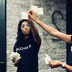
Who are we talking to again?

We’re talking to these lovely people to the right, above this text. People who are proactive in their search for love, friendship and professional connections. The idea here is to further motivate these types of users to successfully completing their intention.
Where + When
I’ve considered where I would introduce the features to create a non-intrusive experience. Auditing the app and creating quick sketches helped me further plan where to place certain functions.


Sketches

I chose four different pages where the new feature might fit well. Let’s first focus on badges and icons, two attributes that are consistent with Bumble’s branding. They’re subtle but still tell how much a user wants to give away. Badges quickly let other users know details about the prospect like astrology sign and height. Icons link the users Instagram and Spotify displaying what type of lifestyle they live.
Now let’s shift our focus to how Bumble uses geo-location to display other users within a certain mile radius. On a specific level they can geolocate mentioned venues between messages. On a broader scale they can collect data for a list of “top things to do” in the area. Bumble could also strike a deal with local businesses so that these top places could get more visibility on the app.
Wireframes

Side-note: the emboldened text in the message means the word is clickable.
I narrowed down my wireframes to focus on the messaging aspect. Messaging real estate is essential in dating apps like Bumble. Taking advantage of this further they could integrate a software like Intercom into the experience. Intercom specializes in conversational marketing. When two people are talking about a specific thing to do, the app could just suggest places to go. I see this lessening the friction and getting more people excited to meet up!
Implementation


Link to the protoype https://invis.io/3USBW0TD6KH
Messaging
What changed:
- Bumble already underlines text like phone numbers so taking it further I underlined the text based on two people’s conversations. They can view nearby places within messaging.
- The places will have filters based on what other people are saying. Noise level, environment, redeeming qualities, etc. So that users can quickly sift through and find a spot to choose.
- Bumble users can discover more information when they click on the selected venue. They also have the option to call, get directions or simply swipe to exit.
- When users return to messaging the text will suggest similar places based on what was viewed prior.
- Once a person has sent a message with the name of a place, the other person can also tap and interact with the venue to see if it’s an ideal scene to meet up.
Conclusion
My morsel of effort in redesigning certain parts of the app doesn’t do the idea enough justice. I don’t doubt the Bumble team has spent countless hours perfecting this app and making sure the brand is top of mind for people. Bumble strikes me as an ethical company that wants to encourage people to meet up and cares about the connections formed via their app. Since the success of a feature like this can be measured it might be worth exploring.
Users don’t see what they don’t see. If the app isn’t helping people along to meet up then we humans get lazy and don’t. We should be making meaningful connections when swiping right.
Stay in touch
- Read more case studies by me on Imani.space
- Follow my UX Design journey on Instagram